Work Development

In this blog post i will be showing my first work prints and what i have done to them and what i am planning to do next. I used Photoshop to edit my images. I started off with a plain portrait of my model then added images of objects which i found on the internet. For one image i changed it to black and white just to try something different. Also to put the objects on the face i had to use the Magnetic Lasso Tool to go round it so i could add it. On one of them i also used the Spot Healing Tool to get rid of spots on her face. I found that tool very effective. As part of the lesson i had to choose one image to print out and get feedback on. Below are the two images i used to edit, and also the edited ones. The one i printed out was the one with just the butterfly. I had to lay it on a table with a small bit of writing saying what i was doing in my project. I then got a lot of feedback from my classmates, most of it was the same but all really helpful. One comment saying “Good idea now try adding more” and another one was “Use more personal objects” both of these are help for when i do my next ones.

IMG_6589

Photoshop image by Emma Anslow

IMG_6598

Photoshop image by Emma Anslow

IMG_655598

Photoshop image by Emma Anslow

IMG_658889

Before image by Emma Anslow

IMG_699598

Before image by Emma Anslow

Independent Project

This week i had to start thinking about what I wanted to do for my own personal project and to start with I had no idea what to do, but when i got thinking and looking back at what I already had done for this project, looking back over my blog seeing which artists i had liked and researched, i came up with some ideas for it. I started by looking back over Linder Sterling and i really liked the way her images worked, and i was thinking about how she must have worked to get the images together so i started by cutting out some images from magazines of faces and placing different things on the face just like what Linder Sterling does. I tired a few different ways, using magazines and the doing some on the computer just cutting and adding different parts of the image. Below are some images of her work.

tumblr_ldxwyoECKl1qfsefco1_1280

Collage by Linder Sterling

13._oh_grateful_colours_bright_looks_vi.jpg.crop_display

Collage by Linder Sterling

For my images using magazines, i cut out models and then added flowers and other things i found in the magazines to them, i wanted to do it this way so that i could practice before I did the real thing by taking my own images and adding stuff to them. Below are some images of the two examples of what i did, close up and far away.

IMG_5994

Collage work by Emma Anslow

IMG_5995

Collage work by Emma Anslow

IMG_5996

Collage work by Emma Anslow

IMG_5997

Collage work by Emma Anslow

Hand And Eye- Work

For this theme Hand and Eye i was asked to bring in prints, magazine images, postcards, found images and anything else i could find to make a collage. I searched my room for anything which i could try to help make my collage look good. To make mine I used a bit of a map, postcard, bits of a magazine and an image which i made while being at university. I did mine about my move from Torbay to Southampton and why i moved there. Which is why i used the bit of the map to show where home is in Devon. I used my image which i made to show that i moved to Southampton to study photography at Southampton Solent University. And i used the magazine cut outs to show that I want to do fashion photography. The bit of postcard which i included was from my sister when she went on holiday, telling me she missed me so i thought i would include it in my collage. Below is some images of my college, I feel like it links most to the work of Kurt Schwitters.

IMG_5988

Collage by Emma Anslow

IMG_5989

Collage by Emma Anslow

Kurt Schwitters made some of the most impressive collages in the 20th century, He makes his collages out of bits of newspaper, postcards and anything else which he can find. I feel that out of the photographers i have looked at my work links best to his because they both just cover the bit of paper with anything and you can still tell what it is. below are some images of Kurt Schwitters work.

kurt 1

Collage work by Kurt Schwitters

kurt 2

Collage work by Kurt Schwitters

My work could also be linked to the work of John Stezaker. John Stezaker uses old images and gives them a new meaning by adding to the main image and making it weird and more interested. I think that it links to mine because in some of his images he uses places which for me makes work personal, which is why i like his work. In the images which i like he has used images of people and covered their faces up with different places, below are some images of his work.

john stezaker

Collage by John Stezaker

20110512124156_stezaker_mask_VIII

Collage by John Stezaker

Websites used in the blog post:

http://www.whitechapelgallery.org/exhibitions/john-stezaker/

Book used in this blog post:

Stezaker, J (2010). John Stezaker. London: Ridinghouse. 67.

Journal used in this blog post:

Prince, M. (2010). John Stezaker: Lost images. Art Monthly, 24.

Hand And Eye- Theme Four

Hand And Eye is Theme Four, this is the last theme which i am looking at from the book ‘Robert Shore -Post Photography’ I have really enjoyed looking at all the different themes and which photographers fit into what ones and what they are all about. It has also helped me to work out why the different photographers fit into each one and understand more elements of photography and how more of it works. The artists in theme four Hand And Eye all explore the materiality of the photography, they all add or take away things from the images to edit them and make them better in different ways. Each photographer that does this does it in a different way, using the same tools but making their images very different from the rest. I have looked at a bunch of photographers this week and have researched some of them in more detail. I picked my favorite three of which my tutor gave me.

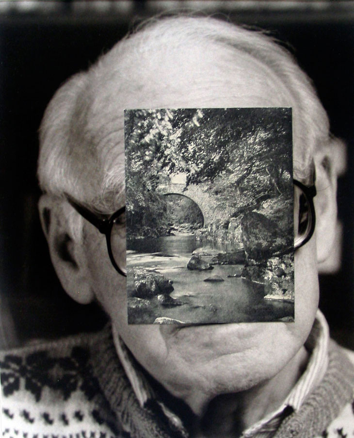
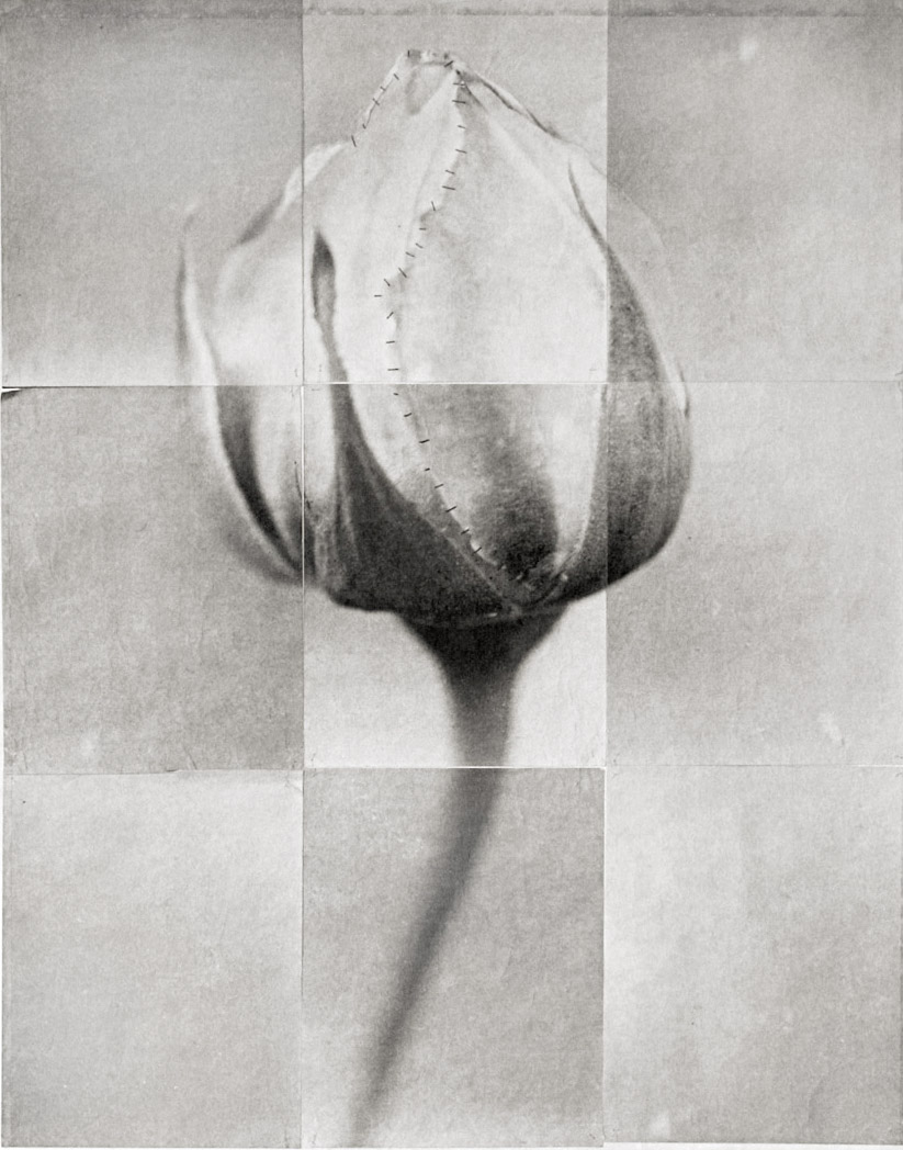
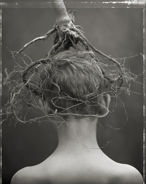
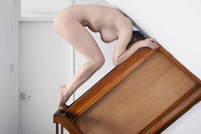
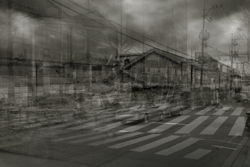
The first artist i have researched is Charles Grogg,born in 1966 in Gary, Indiana. First became interested in photography when his dad brought him a Leica camera. He is know well for his fractured photographic images which are printed onto handmade Japanese paper in either silver or platinum/palladium. He stitches their components together with tethers, sutures or three-dimensional material. Below are some images of his work, each of these images show the style of his work and shows you what it looks like. I like this work because it is very different and i like different when it comes to photography, it really interests me.

charles grogg 3

Photo by Charles Grogg

charles grogg 2

Photo by Charles Grogg


charles grogg

Photo by Charles Grogg

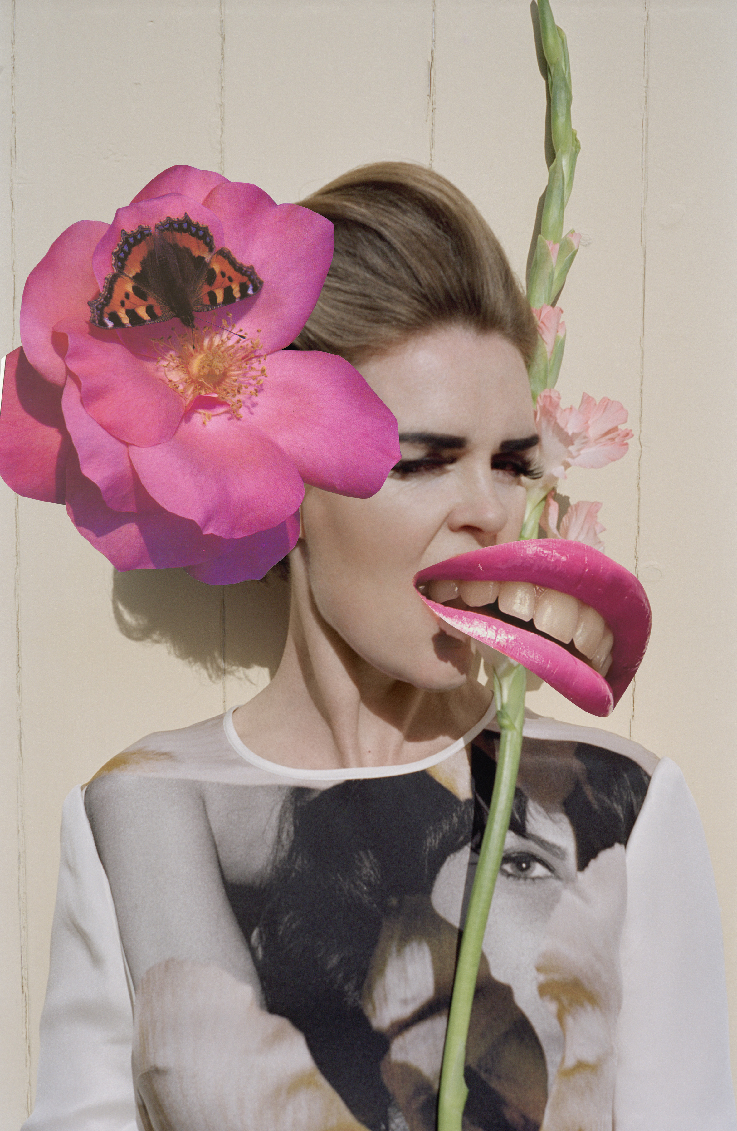
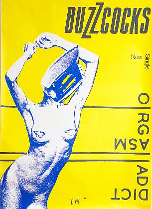
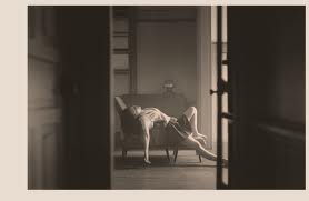
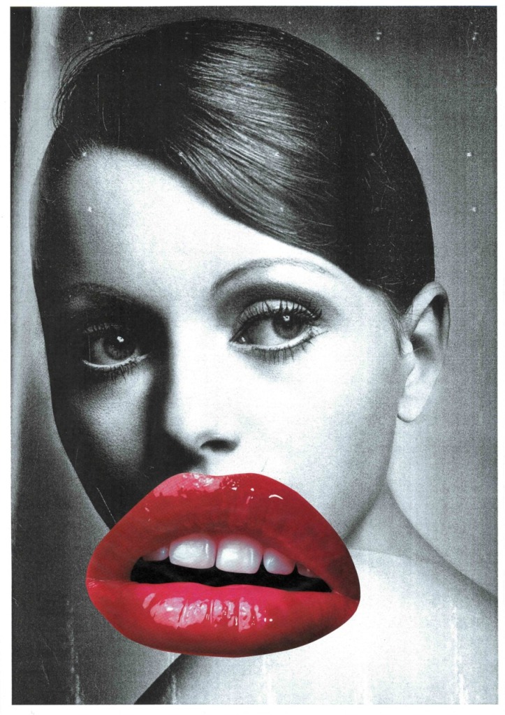
The second artist which i have researched in this theme is Linder Sterling who is a photographer born in Liverpool in 1954. Mostly well know for her work on the Buzzcocks single cover called ‘orgasm Addict’. That image is shown below, she made this by going round her house and making a collage of found images from pornographic magazines and household magazines.

buzzcocks image

Buzzcocks cover by Linder Sterling

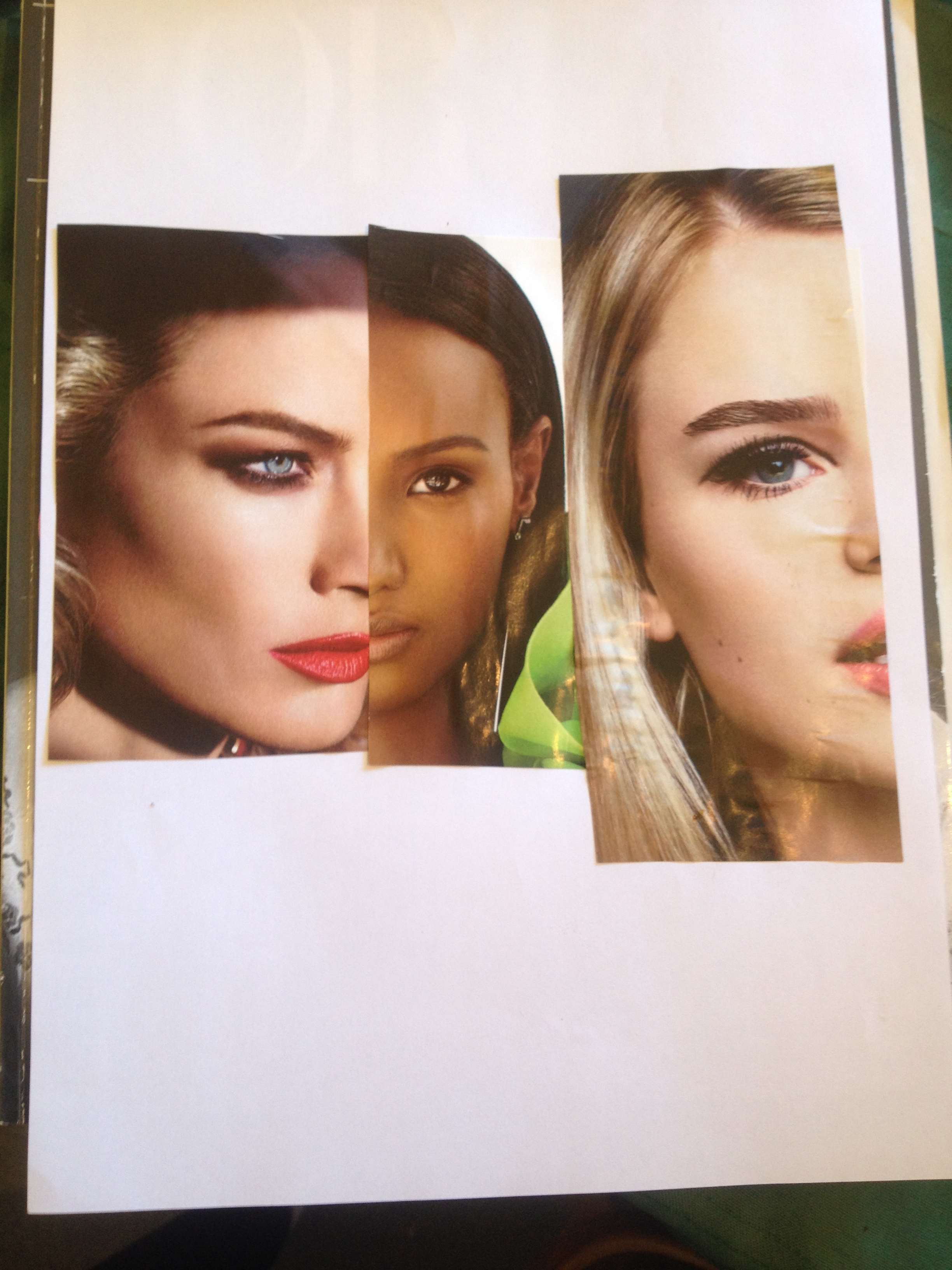
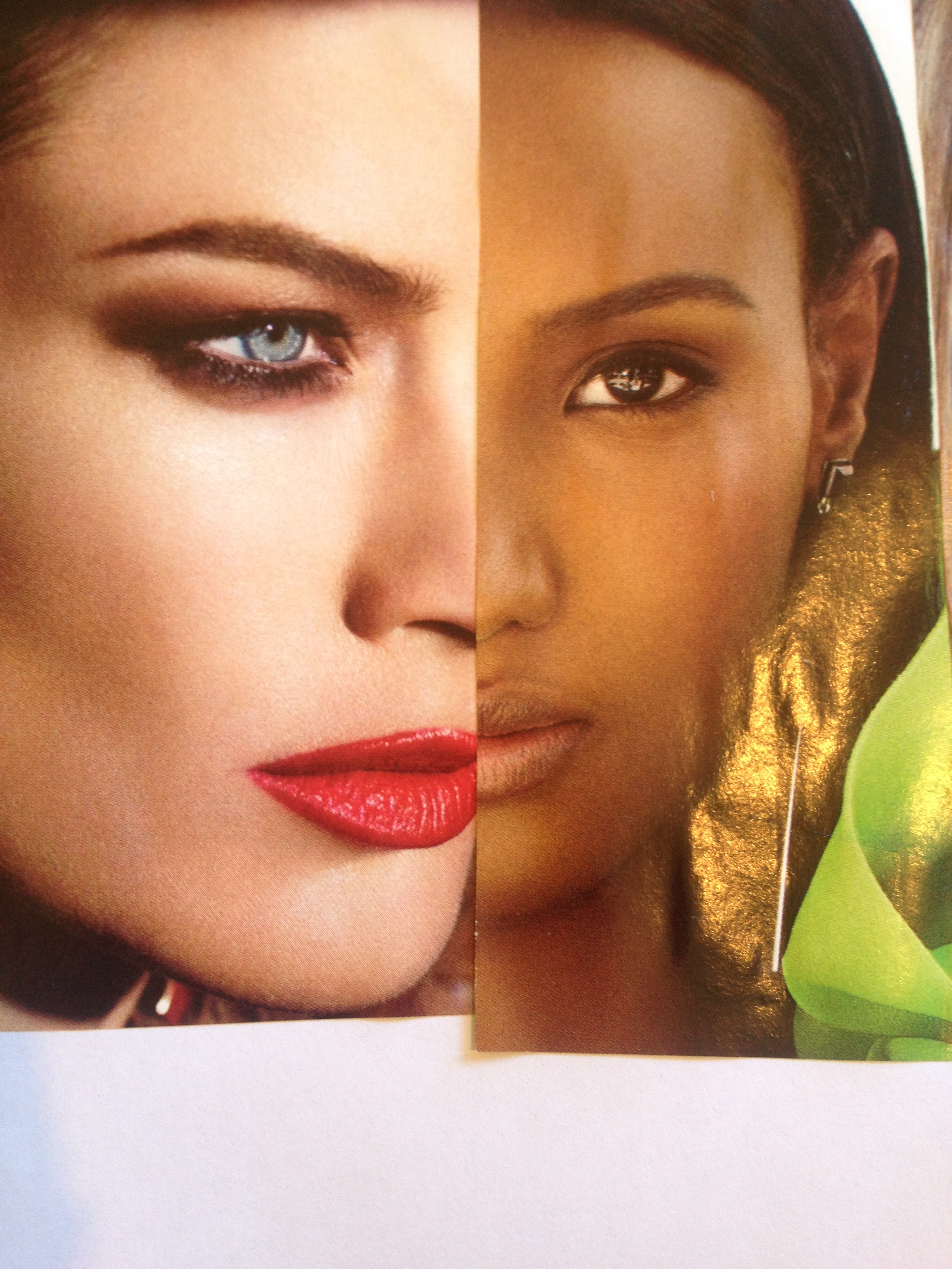
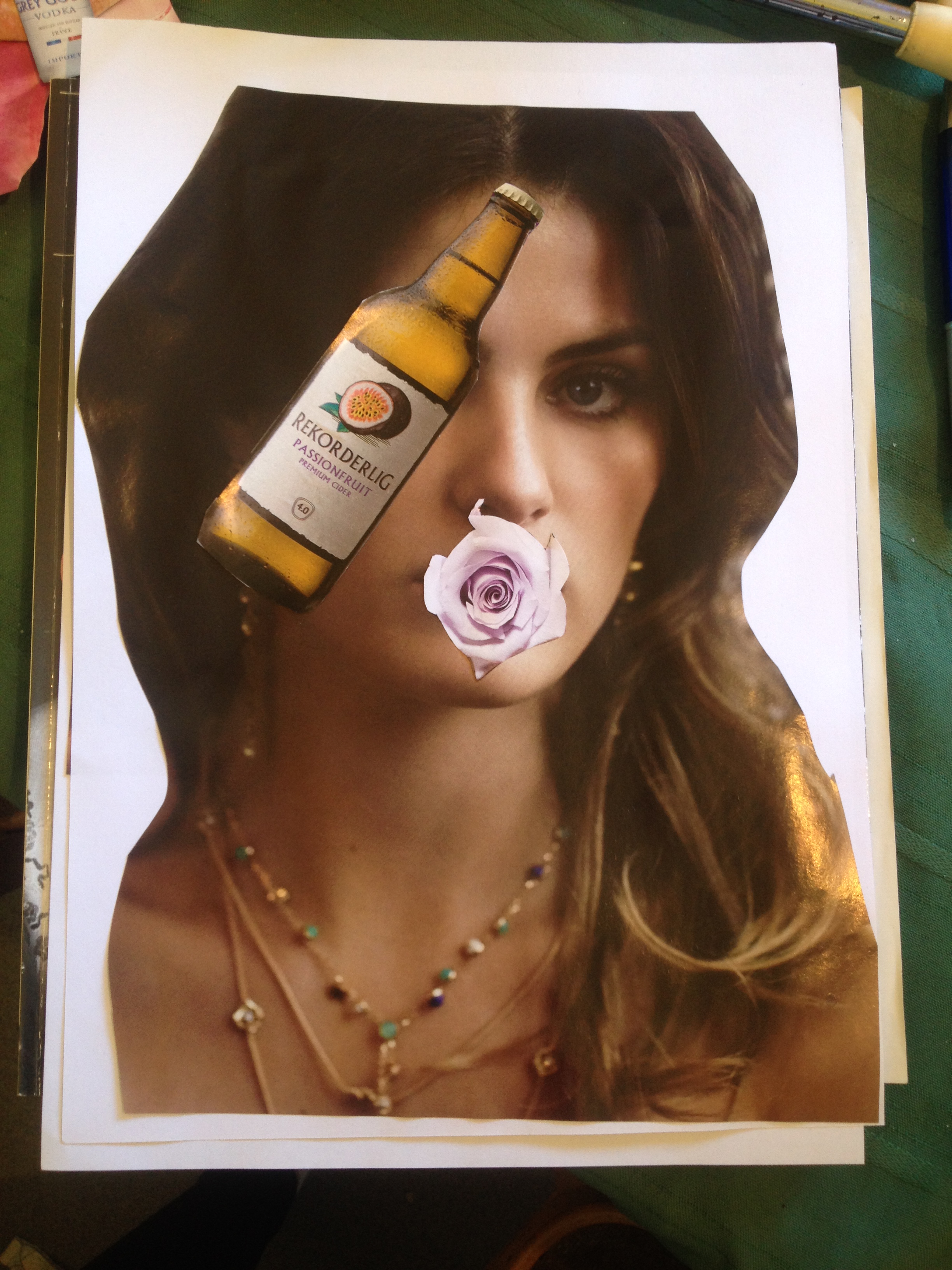
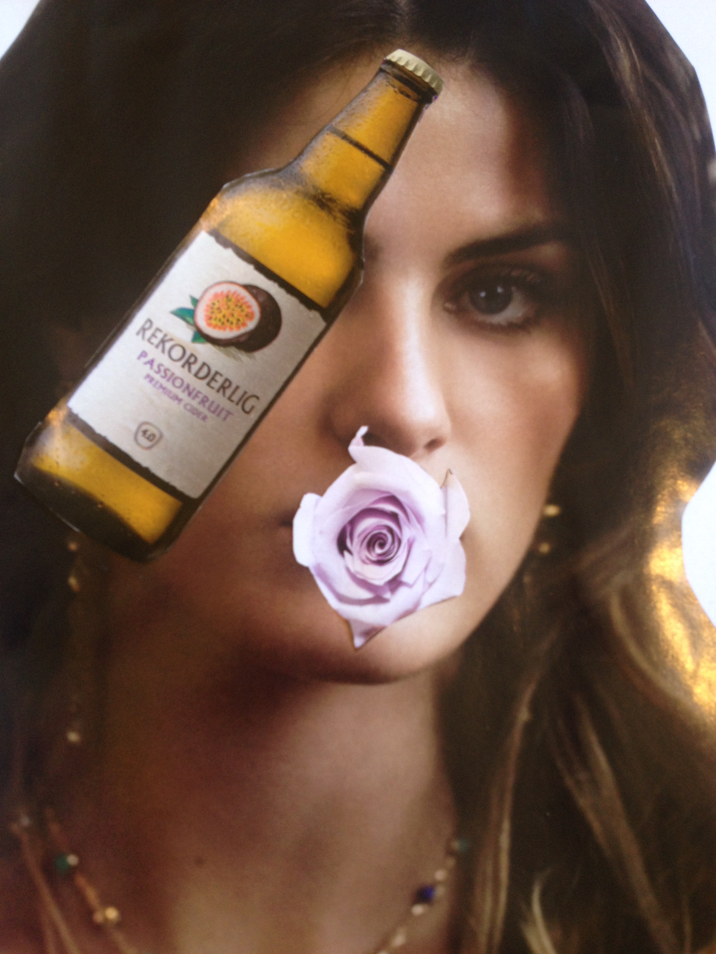
Most of her work is made up of collages of found images in magazines and newspapers, i really like her work because even though its not meant to be in the image is just works when it is put together, below are some images of her work.

13._oh_grateful_colours_bright_looks_vi.jpg.crop_display

Collage work by Linder Sterling

tumblr_ldxwyoECKl1qfsefco1_1280

Collage work by Linder Sterling

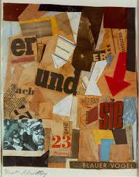
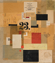
The last person which i researched for this theme was Kurt Schwitters who is a German painter, sculptor, designer and a writer. Studied at the Kunstakademie in Dresden (1909-14). He was a key feature to modernism, making some of the most impressive collages of the 20th century. He makes his collages out of bit of newspaper and anything he can find, below are some images of his work.

kurt 1

Collage work by Kurt Schwitters

kurt 2

Collage work by Kurt Schwitters

Websites used in this blog post:

http://pfmagazine.com/2011/magazine/the-world-of-charles-grogg/

http://www.hepworthwakefield.org/Linder/

http://www.mam.paris.fr/en/expositions/linder

http://www.theguardian.com/artanddesign/gallery/2013/jan/05/kurt-schwitters-collages-tate-britain

http://www.moma.org/collection/artist.php?artist_id=5293

Journals used in this blog post:

Sherwin, S. (2013). Paper Tiger: Linder Sterling. W. 42, 78.

Zimmer, W. (1997). Musings on collage: The photomontages of Romare Bearden. The New York Times.

Book used in this blog post:

Eskildsen (2013). Erwin Blumerfeld: Photographs, Drawings and Photomontages. New Haven: Yale University Press.

Dietrich, D (1993). The collages of Kurt Schwitters: Tradition and Innovation. Germany: CUP.

All the world is staged- Group work

All the world is staged is the name of theme three, we got split into groups to do group work for this theme but i wasn’t in when we got put into groups so i had to join a group late where they had actually already done the work, i joined a group with ‘Sam, Jess and Riley’.

In their group work they had focused on staging and capturing people’s facial expressions but removing the context from the photos which was the phone, they got their models to play a game on their phone and then photographed their facial expressions and certain times.

Below are some of their images:

_MG_0062 _MG_0065 _MG_0067 _MG_0079 _MG_0084 _MG_0090 _MG_0072

These are images of their different models playing the game on the phone.

By looking at this work it reminds me of the work by Mike Larremore, he did a project called ‘Faceboard Project’ this was focusing on a number of models and their different facial expressions which is why i think that it links to the work which Jess, Sam and Riley have done above.

Below is an image of Mike Larremore’s work:

man face 2

Faceboard Project by Mike Larremore

Here you can see a number of different facial expressions within his images.

The group then went onto make there still images into a sort of gift to give it more of an effect when looking at it, below is a sample of it:

2 Jess 3 Lottie

As you can see they are both samples of different models as gifts, both showing different facial expressions and reactions to the game on the phone.

All The World is Staged – Theme Three

This week we started to look at the next theme which is ‘All the world is staged’ this is about whether the image is staged or real life. Most of the photographers in this theme work in a way that suggests they actively construct or orchestrate a photo. We got shown a number of photographers showing different ideas of how they would have been staged. The one’s i liked the most are listed below.

Polly Penrose is a photographer who takes nude self portraits she has been doing this for a few years but no one actually saw her work till she entered a nude portrait competition. Polly says: “I think that the fact the images are self portraits it gives them a certain strength.” She also says “They can not be to composed or laboured, they are taken on a cameras self timer and this in turn creates a very raw, honest image.”

nude 1

From the series ‘A Body Of Work’ By Polly Penrose

nude 2

From the series ‘A Body Of Work’ by Polly Penrose

nude 3

From the series ‘A Body Of Work’ By Polly Penrose

I really like her work because I have never seen nude portraits like it and it makes them more interesting the way she has done it.

Another photographer I liked was Hisaji Hara who is a photographer in Japan, the work i liked is shown below:

hisaji hara

 ‘The Salon’ By Hisaji Hara

images 1

 ‘The Room’ By Hisahi Hara

I liked this work because you cant really tell whether it is actually staged or not, it doesn’t give you much to work with but I like that about it. The first photo above looks staged but the bottom one doesn’t.

Websites used in this blog post:

http://www.pollypenrose.com/index.php?main_section=body_of_work

http://www.london-photographic-association.com/site/pages.php?fid=0,182,715

http://hisajihara.com/pineapple1/

http://www.theguardian.com/artanddesign/2012/feb/26/hisaji-hara-photography-hoppen-review

Group Work for Layers of Reality

Group Work for Theme 2.

Here I am going to post my group work which we did for theme 2, Layers of Reality. We started by taking pictures in long exposures and using a model to walk up and down stairs and in and out of doors. Then in the lesson we put the images on the computer to see what images we liked best then putting them onto Photoshop we changed them to black and white. After we had picked the photos and made them how we wanted, we then put one on top of each other and testing different ways till we got the final and finished one. To come up with our final image we all researched a different artist mine being Francesca Woodman, I researched into her black and white blurred images to see the style that she did it.

In class this week we got to show everyone our work and explain how and why we did it, the feedback we got back went well, everyone understood why and how we did it.

Below is our final images:

image 1

Double Exposure by Emma Anslow, Riley Gray & Jess Glendenning

image 2

Double Exposure by Emma Anslow, Riley Gray & Jess Glendenning

Theme Two Artist Research

This is my second bit of artist research for theme 2. Last week we were asked to get into groups of 3-4 to come up with our own interpretation of the theme ‘Layers into Reality’ My group is formed up of me, Riley, Jess and Luke we were very interested in blurred images and the way you can’t see all the image but still understand it.

Each of us did our own research and found an artist we liked, the artist which I have researched is Francesca Woodman.

Francesca Woodman is an American Photographer who works mostly on black and white self portraits. Her images are different to most self portraits because you can’t actually see all of her in the images you can just see part of her which is why i like her images. Francesca Woodman only had a short career as she committed suicide at the age of 22. Most of Woodman’s images were taken using a slow shutter speed, the long exposure meant that all her movements were captured and were shown as a blur.

Below are some of her images:

blurred image 2

‘From Polka Dots’ (1976) By Francesca Woodman

blurred images 1

Image by Francesca Woodman

I think that Francesca Woodman’s work links to my group work because we have focused on the way you look at the main bit of the image which is the blurred bit and then you look at the background which is the bit in focus. We have also done it in black and white to get the same effect which she has, the ghostly effect.

Websites used in this blog post:

http://www.telegraph.co.uk/culture/art/art-news/9279676/Blurred-genius-the-photographs-of-Francesca-Woodman.html

Journals used in this blog post:

Johnson, K. (2012). Exposing the body, baring the soul – Francesca Woodman. The New York Times. C25.

Williams, R. (2013). Francesca woodman. Womans art journal. 34, 54.

Book used in this blog post:

woodman, F (2012). Francesca woodman. new york: D.A.P./Distributed Art Publishers.

Layers of Reality – Theme Two

Theme Two – Layers of Reality

The second theme which I am looking is called Layers of Reality. When i first here that I think layers of images on top of each other or more than one image in an single image. I really like the idea of this theme and I feel that there is a lot which I can do with it and i can use different ideas together. I am currently looking at the book called ‘Robert Shore, Post- Photography’ which is full of the different themes.

We often speak of the camera as having an ‘eye’, but that eye does not see the same way as oureyes do. Quote from the book Robert Shore, Post- Photography

As a group we were given a few photographers to choose from which we can pick the ones we like and research further in. One which really stood out for me was Jae Yong Rhee and his series called ‘Memories of the Gaze’ I really liked this because the way he has done his images makes them really stand out and look interesting. The way he does it is using a technique of digital layering to offer a moving tribute to his country’s vanishing industrial landscape. Each image of the Rice Mills is created from around 150 separate photographs from different angles taken over a year.

Below of some which i have picked out:

gunsan2_ws

Memories of Gaze 2009-2012 by Jae Yong Rhee

siseonyi_gieog_apateu2_ws

Memories of Gaze 2009-2012 by Jae Yong Rhee

Websites used in this post:

https://artloftasia.com/artists/jae-yong-rhee

http://www.galleryem.co.kr/node/48

Appropriation

In art history Appropriation refers to the pre- existing objects or images in their art with little transformation of the original. I think appropriation is when someone does a piece of art work and then a few or more years later someone else re does it in their own way or changes it up to how they see it or even modernizes it to the up to date time or year.

I really like the idea of Apporpriation because I sometimes look at a piece of work by an artist and look at how i would change it up and do it my own way. I also like looking at an artist’s work then re-doing it my own way, maybe by changing the colours or something else a different.

Websites Used:

http://www.tate.org.uk/learn/online-resources/glossary/a/appropriation

http://www.moma.org/learn/moma_learning/themes/pop-art/appropriation